Synopsis
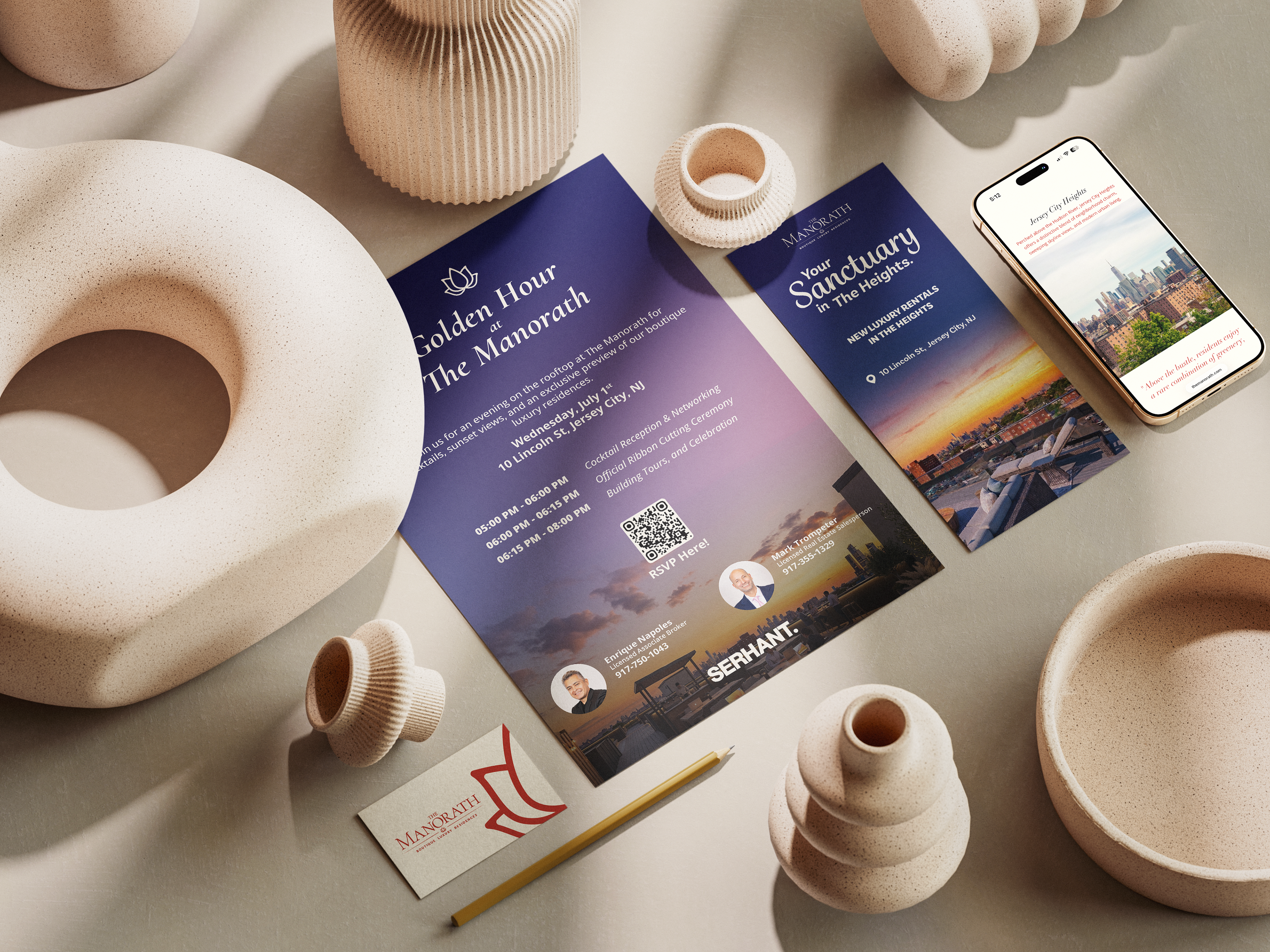
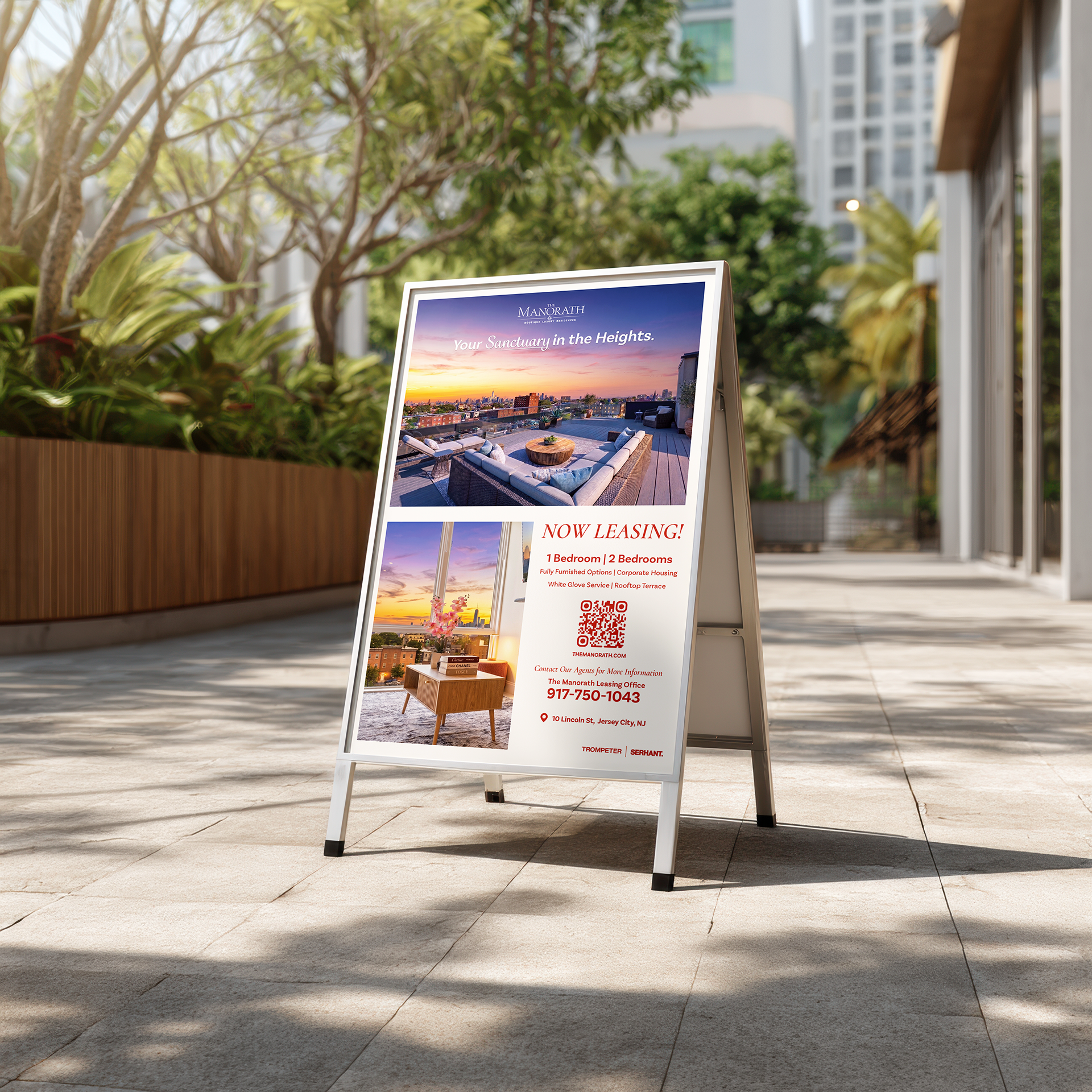
The Manorath is a 27-residence boutique development in Jersey City Heights, with three sub-brands: residences, a wellness center and a grocer. I designed its brand system and launch campaign from business cards to full-sized window graphics (that were taller than me, yes).
The Problem
The client came to us with a logo mark and a challenge: scale it into a brand that reflects their cultural roots and heritage, and still reads as luxury. That's a real tension. Heritage leans warm, rich and ornamental; luxury in New York and Jersey City leans quiet, minimal and photo-led. The brand also had to hold three sub-brands, residences, a wellness center and a grocer, under one name, and work at every scale, from a business card to the building's storefront windows. And it had to launch a new 27-residence building in a competitive rental market, offering more privacy than a tower and more polish than a standard apartment.
The Thinking
Terracotta and cream with a gold accent, paired with a serif that matched the client's taste, read as culturally rich Indian heritage. The palette draws from the building itself and from Indian luxury design, where the pairing signals warmth and richness. On business cards and stationery, up close, it reads as premium.
At storefront scale, the same contrast read as a retail sale. My creative director helped me see the campaign didn't need to be carried by color, especially for a real estate property. Nobody rents a color; they rent the view. So the campaign lets the rooftop, skyline and sunset lead, with terracotta and cream as the frame. Color signals the residence's identity; photography signals the experience of living there.
Roles
Brand Identity, Graphic Design, Print Campaign Strategy
Moodboard

Color Palettes

Logo Designs

Print Campaigns


Credits
Client: SERHANT. , The Manorath
Creative Director: Leon Hui
Photographers: Jay Griffin, Mohit Issrani, Leon Hui
Videographers: Leon Hui, Jay Griffin, Mohit Issrani
Designers: Leon Hui, Khrusha Parekh